
Mixer Magazine - Tortured Souls
Phillip Wong Photography
Editorial
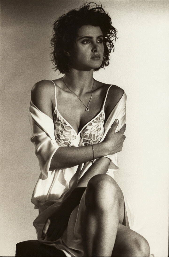
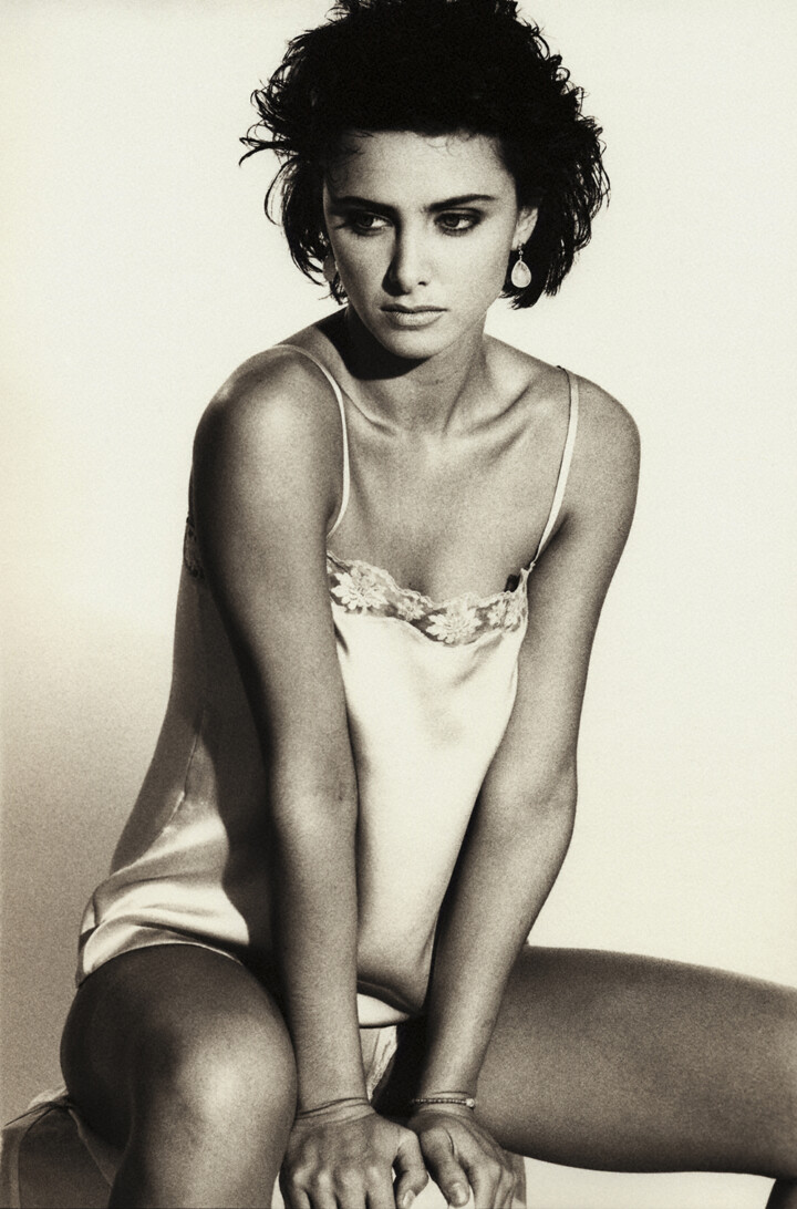
Mixer Magazine – Tortured Souls – Five Doors – Personals
MixMag changed their name to Mixer Magazine while I was shooting fashion and profile images for their DJ-focused and music event oriented publication. I wanted to show the differences
Tortured Souls was one of a number of fashion editorials I did for them based on whimsical stories we thought would be different in approach to mainstream fashion.
It was released in early Spring, but had to be produced immediately after New Year, and I shot it on New York streets on a cold, windy, wet night. I usually didn’t abuse models like this but was grateful for their participation and support.
The clothes were all showy, nightlife, pulled together because the publication had so little production time or resources, but I wanted to create the feeling of illusion and excitement of the night world.
But Mixer had a whimsical, ironic approach to fashion and Five Doors and Personals mocked parts of society that it’s readers had knowledge and relationship of.


A Magazine
Phillip Wong Photography
Editorial
A Magazine
“A” Magazine was a publication aimed at a younger Asian audience. I was asked to do this shoot with a group of Asian models and actors who were cast by the editors of the publication.
It was interesting for me, because while I have an extensive knowledge and understanding of race, color, diversity identities, it has always been from an “outsider’s” perspective. This project gave me another view.


Pellice Moda - Rail Yard
Phillip Wong Photography
Editorial
Pellice Moda – Rail Yard
In working with luxury goods, and in luxury environments, I’ve always been aware of contrasts between the most valuable of items, the people who wear them, the people who create them, and what creates the idea of “luxury.”
Contrasting the luxury of furs and the Old World that embraced that idea of luxury, with the age and romanticism of that world – I convinced my editors at Pellice Moda, that the editorial story would have beauty, interest and appeal. They introduced me to Nadya Khamnipour, a stylist who’s work I loved – lush, whimsical, contrary, resisting cliche, her combinations of accessories with textured clothing created a balance with my need to focus on the evocation of emotion, or a stark, textural landscape.


Italian Vogue - Intense Silhouette
Phillip Wong Photography
Editorial
Italian Vogue – Intense Silhouette
I used to describe the difference between working for European publications with America publications like this: In Europe, as a photographer, an artist, a creative, someone outside, with a wide mix of influences and resources, I could propose something, and while editors might not understand completely, they trusted in that background and allowed me to produce the piece.
In America, I described publications as having a “Donald Trump mentality.” The people in offices, cloistered and separated from the trends and developments and people on the ground, dictated that “this was the way it was.” This was the way it was going to be. And because I was simply hired with a camera – I would do what I was told. (I was defining this “corporate” way of looking at the world, in the 1990s).
Italian Vogue editors didn’t always understand what I was trying to describe (a cross between imperfect Italian and overly complex English), but they often let me go ahead. They had products or trends or parameters which they wanted to cover (they had writers already working on an article), but they were looking for “creative,” “different,” “interesting,” visual images. (Not surprisingly, those were some of the first words I learned in Italian.)
I had been looking at textile shops and in New York, found some stretchy tubular material (I later found was used for undershirts), and bought a few rolls of it. In Milano, I tried wrapping it, and liked the form-fitting quality of the material – but didn’t see what I could do with it.
Alberto Nodolini, and Luca Stoppini, handed me off to Vogue Pelle to shoot some handbags for a story. I saw the stark composition and silhouette of the bags, and wanted to contrast it with the forms, shapes and curves of the human form.
The difficulty of accessories has always been the proportional difference between any accessory and the human body. When other items are added to the mix – they can create distractions.
They let me run with this:


German Playboy - Jeff Koons - Martina Moculescu
Phillip Wong Photography
Editorial
German Playboy – Jeff Koons – Martina Moculescu
The first time I returned from Europe, I was contacted in New York by German Playboy to shoot a scene with the Playmate of the Year and work with Jeff Koons.
I had been in Europe when Koons was becoming notorious for his work with his wife, Ilona Stadler.
He had a studio in a building on Broadway and Houston, and I agreed to work with him and a crew of people German Playboy had assembled. Koons had pitched an idea to the editors who wanted his name involved based on postcards of two paintings: Jean Honore Fragonard’s Girl Playing With A Dog, and Francois Boucher’s Resting Girl. He loved the lushness of the 1700s ambiance, and I was looking at focusing on Martina Moculescu, whom I had just met, but as a Playmate of the Year, I thought the qualities that made her special, should be brought out.
I loosely followed Koon’s desire for lushness, and the framework of the artwork on these postcards, and produced the three images here. (She was also shot by two other photographers in other countries.)
A number of years later, Jeff Koons came out with his “Gazing Ball” collection which used the Boucher painting, and then a collection which featured “Pot Rack” in which my photograph of Martina, based on Fragonard’s painting, was the foundation behind the Koons painting.
I thought the dog was lost behind a flurry of pans.


Gear Magazine
Phillip Wong Photography
Editorial
Gear Magazine
Gear Magazine was a publication that emerged when Maxim and FHM made their way over from Britain and their explosive success revealed latent markets in America.
Gear was different, but couldn’t brand itself differently. Gear was started by Bob Guccione, Jr. who had launched Spin Magazine earlier, and who’s father had brought Penthouse to America from Britain.
Edgy, offbeat, but serious about a new crop of artists, actors, musicians, emerging and defining a new culture, Gear recognized my informal, direct and honest approach matched their perspective with my photographs of Angelina Jolie and Charlize Theron, and brought me onboard. They asked me to pitch personalities and story proposals.
As I saw how they developed layouts, graphics and content, I quickly saw the potential in his vision.
But they couldn’t keep up the financing, marketing, or production necessary to continue competing with Maxim, FHM, GQ or Esquire at the same time, technology was changing digital publishing.


Funki Porcini - Mixer - New York
Phillip Wong Photography
Portrait/Editorial
Funki Porcini – Mixer Magazine
While in London, I became friends with models who often spent nights going from pubs where they would gather information about various raves, and we would be invited to squats and warehouses, junkyards and undergrounds.
I knew something about the House music scene emerging from Chicago, and London blew the scene up. When I came back to New York, I began working with a small publication MixMag, which changed to Mixer, which highlighted the DJs who emerged to become the stars of the underground scenes.
Funki Porcini was one of the many artists who I was introduced to, and his mocking of money in his work made me hunt down handfuls of play money to burn in our shoot.
Like the London publications, young American designers were seeking to push the edges of design, but with a constant pressure of deadline and budget, we can see differences.


Brands - London
Phillip Wong Photography
Fashion/Editorial
Blitz Magazine – Brands
While I have worked for established publications and designers, I have also sought to work with smaller, newer, developing and potentially influential magazines and designers.
In London, The Face, ID, and Blitz came from the street to make influential statements in graphic design, photography and styling. The editors and graphic designers at the emerging publications shaped the publishing of France, Italy, Britain and New York as their work was recognized.
Neville Brody, at The Face, commented on my choice of framing and composition, as editors from all three publications called when I went back to Milan, and they wanted content from the Continent.
Branded was conceived by Blitz in London, but as all these publications were constantly on a tight schedule, they gave me a day to plan, shoot and send the material back to London.
I was given a handful of branded items, booked friends who were available that night, shot everything on black and white Polaroid film, turned everything around in hours and had it going back to London by morning. It reminded me of spot news photography in speed and production.
The graphics on the vertical page sides echoed the the extreme sharpness of lighting and starkness of the black and white but was done in London.


Anna Lingerie - London
Phillip Wong Photography
Fashion/Editorial
Anna Magazine – Lingerie Story
When I arrived in London from Milan, I wasn’t planning on shooting, but I went to visit publications, modeling agencies, people in the industry, just to introduce myself.
I had viewed British fashion as going in two separate directions for a very long time – the classic, society designers and retail establishments, and the “street,” more irreverent, politically opinionated, structurally diverse, newer designers.
Anna Magazine contacted me soon after I arrived. I was dependent on the first agencies I visited to point me to studios, labs, make-up, hair, stylists, assistants and of course, they helped me with the models.
In New York, I had developed a black and white toned look that had a classic feel. Because I did everything myself, and each part of the process had been developed myself, I needed access to a lab, chemistry, equipment or use of these elements.

Beauty Sun Care (German)
Phillip Wong Production
Editorial/Beauty
Beauty Sun Care
Over the course of two weeks, when working with the German publication Madame, our production shot content for multiple articles, from fashion, to beauty, to lifestyle and covers.
Balancing between the models that editors (and I) wanted, and location availability, transportation, small item (usually accessories), hair and make-up, we ended up with a beauty shoot, and a cover that we had to shoot on the last day.
The beauty story was about an awareness of sun on the skin of fair skinned people (our model had red hair). The hair and make-up was light and natural, but we needed a location.
I went in back of our editors’ hotel, and finding a few palm trees and a view of the ocean, asked hotel management if we could shoot there. Since the editors had rooms there, management had no problems with our using the area.
Using the palm trees as a backdrop, some gauzy material, a white swimsuit bottom that we hadn’t used on any other shoots, I stripped the beds, and asked one of the housekeepers for additional sheets, climbed the trees that would be on of our backdrops, and wrapped them in white.
Wrapping the model’s white bikini bottoms with a gauzy wrap (to echo the wrapped trees), and leaving her topless (to emphasize the skin and sun and cloudless skies), we finished the shooting within an hour. We shot her as one potential cover, and another model (who was being made-up as we shot), for the cover the editors guessed would be used.
In both cases, we had to work fast – the sun was burning and tanning both models with each moment in the sun (which we would later see in our shots as time progressed).


